Joe Zidle: The Optimist Plays the Long Game
Recently, my partner in investment strategy, Byron Wien, reminded me that pessimists generally do not survive long in finance. Byron entered the finance world nearly 60 years ago. At 89 years young today, his relentless curiosity, creativity and insights continue to inspire and are a testament to the power of optimism.
I’ve been thinking about this valuable lesson as headlines in the financial press and investor sentiment turn increasingly sour. This sentiment is easy to understand, with the S&P 500 officially entering a bear market and many equity markets around the world in similar straits. Combine that with historically poor performance in traditional fixed income, and the result is the worst YTD performance for the 60/40 portfolio since the 1960s.1 The economy and markets face important near-term challenges, including unrelenting inflation and coordinated central bank tightening that will most likely lead to a recession at some point.
And so, these days, virtually every conversation I have includes this question: “When?” I’ve consistently taken the “over” on the consensus view of a recession because of the still-strong cushion of household excess savings and the high level of cash on corporate balance sheets. These two factors are primary reasons why there is still strength in the economy.
Focusing too intently on when a recession might strike carries risk. During challenging conditions, people seem to forget that economic cycles are just that—cyclical. And that cycles have their ups and their downs. In the end, healthy economies grow, and markets generally move up and to the right over long periods. If greed were investors’ worst enemy at the top of a market, fear is their worst enemy when markets are challenged. The winner in either environment will be the clear-eyed investor who considers the long-term fundamentals and invests with conviction in themes that can deliver attractive risk-adjusted returns.
In this month’s essay My team and I evaluate recession indicators while considering near-term macroeconomic headwinds. Also, to gauge the timing and depth of a potential recession, we look at how today’s fundamentals compare to historical examples. We draw out key differences between these examples and highlight that the recovery looks significantly different in each instance based on two key factors: labor markets and housing. On US housing, which we view as critical to understanding the potential severity of this next recession, we remain optimistic about its secular prospects.
Parsing Recession Indicators
In past essays, I highlighted several indicators that we watch to gauge the risk of recession. The signal from the yield curve is one to which I always assign great value. I think that the 10Y/2Y portion of the curve has the best track record in predicting business and economic cycles. Over the past 50 years, the curve has inverted six times, and six recessions followed. This signal never generated a false positive.
While reliable as a signal that markets are pricing in economic trouble ahead, the curve does not predict timing. The amount of lead time between inversion and recession has ranged from 8 months (2020 recession) to 35 months (2001 recession), with an average of 20 months. The 10s/2s portion of the curve briefly inverted in June 2022 for the second time in 3 months, and I take that seriously.
Most recessions require certain dominoes Because the yield curve does not predict timing, I look at preconditions that generally fall into place prior to an economic downturn. I focus on three main indicators of economic health due to their combination of relative robustness and simplicity: the Leading Economic Index, corporate profits and labor markets. And typically, they fall like dominoes.
The Leading Economic Index (also known as leading economic indicators, or “LEIs”) usually flash their warning sign first, when their year-over-year growth peaks and eventually turns negative. Then corporate profits growth turns negative as overall conditions become more challenging. Finally, companies reduce employment levels, and the unemployment rate rises. Often, by the time this last piece falls, the economy is already in recession.
Predicting when this happens is difficult, but history can be instructive on the potential range of outcomes. Table 1 shows the relative amount of lead time each indicator has had historically on average. Notably, while some of these indicators have weakened, none of them have fallen durably into place yet.
Table 1: Number of Months between Indicator Signal and Following Recession2
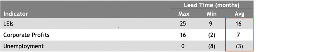
Source: Blackstone Investment Strategy, Bureau of Economic Analysis, Bureau of Labor Statistics, Conference Board and Bloomberg. Represents all recessions between 1/1/1960 and 12/31/2021. Data are omitted for the 1982 recession due to the short interval between the start of that recession and the end of the one preceding it.
Strength in balance sheets Currently, a strong argument for continued near-term momentum in the economy is the cushion provided by household and corporate balance sheets. Figure 1 highlights the massive increase in liquid financial assets on household and nonfinancial corporate balance sheets. Respectively, they were $5.8 trillion and $1.1 trillion higher in 1Q 2022 vs. the same period in 2019. The personal savings rate has fallen in recent months, implying that households are drawing down savings as they grapple with higher inflation and lower real wages. However, the data show that there is still a strong cash buffer.
Figure 1: Liquid Financial Assets on Household and Corporate Balance Sheets
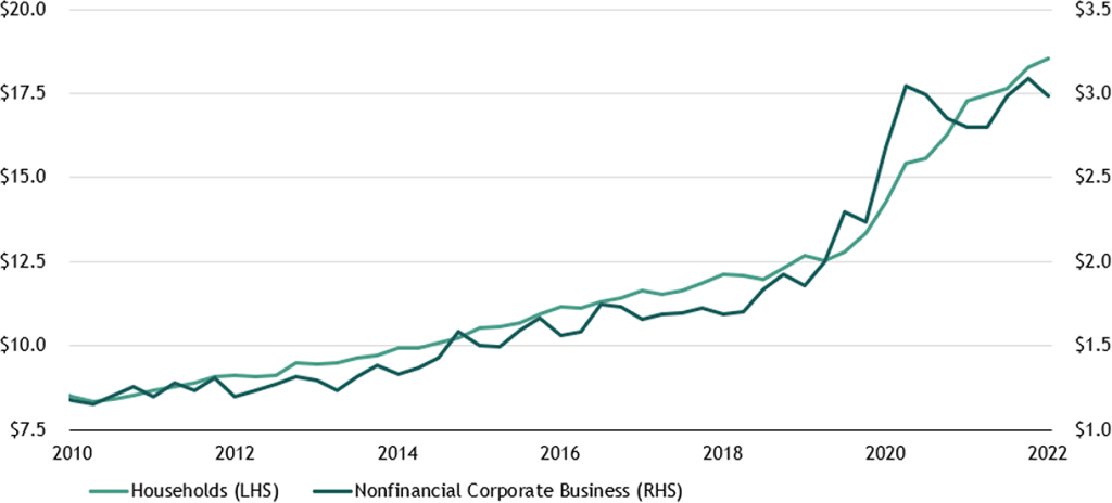
Source: Blackstone Investment Strategy, Federal Reserve and Haver Analytics, as of 3/31/2022. “Liquid Financial Assets” include the following for households: deposits in foreign countries, checkable deposits and currency, savings deposits and money market shares. For nonfinancial corporate business, it includes the following: checkable deposits and currency, money market fund shares, asset security RPs, commercial paper, Treasury issues, Agency & GSE-backed securities and municipal securities.
Historical Perspective Critical
To understand how today’s conditions stack up to prior cycles, the Tech Bubble of the late 1990s/early 2000s and the Global Financial Crisis (GFC) of 2007/2008 are instructive because they represent two different kinds of recessions: one short and shallow, and the other deeper and more protracted. And with inflation the highest it’s been since the 1980s and many expecting this Fed hiking cycle to be the most aggressive since the Volcker era, it’s also worth analyzing the double-dip recession of the 1980s. Prior to the GFC, the 1981–1982 recession was the most severe downturn in the economy since the Great Depression.
Not all recessions have the same impacts In the Tech Bubble, the Nasdaq fell more than 75% from peak to trough, and the S&P and Russell 2000 fell nearly 50%. Bonds acted as a diversifier for investors, and home prices were largely insulated from the rout in stocks. Despite the massive pain in financial assets, the recession that followed was relatively surface-level and short-lived.
During the GFC and related housing bubble, stock performance was not all that different from the bear market that immediately preceded it. The S&P fell more than 50% from peak to trough, and bonds held up again. But this time, the correction in excess speculation in housing markets resulted in a 25% drop in home prices nationally. The 1980s double-dip recession featured a less severe market drawdown of roughly 24% in the S&P 500 from peak to trough. From the start of the first recession to the end of the second one, bond market returns were strong and home prices appreciated modestly.3
Figure 2 highlights the effects of each recession on household net worth, adjusted for inflation. During the 1980s double-dip and the Tech Bubble, household net worth did not decline significantly and then continued to rise. During the GFC it fell significantly and then took years to slog back up. Figure 2 also includes the COVID crisis to show how steep the initial drop was, and to show how remarkable its bounce back has been relative to these recessions.
Figure 2: US Real Household Net Worth
(Indexed to 100 as of one quarter prior to recession start)
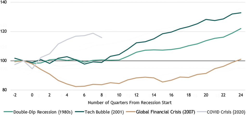
Source: Blackstone Investment Strategy, Federal Reserve Board and Bureau of Labor Statistics, as of 3/31/2022. “Household Net Worth” includes households and nonprofit organizations. Data are adjusted for inflation using the CPI-U: All Items in U.S. City Average, index 1982-1984=100).
Historical Comparison 1: Housing
One key explanation for the differing recession outcomes in the past is that Americans are just generally less exposed to financial markets than they are to housing markets. While the share of home-owning Americans peaked in 2004, the data still support the view that housing wealth outweighs exposure to financial markets, whether stocks or bonds. The latest official data show that about 53% of US households own stocks directly or indirectly, and 51% have a retirement account, which is typically diversified between stocks and bonds. By contrast, 65% of Americans own their primary residence (interestingly, the exact same level as 1Q 1980).4 While the data do not reflect post-COVID shifts, household ownership of stocks and homes have been generally stable over time.
Home is where the wealth is In terms of absolute values, the data also show that households are more levered to homes than they are to stocks. In 2019, the median value of stock holdings for the bottom half of the income distribution was about $10,000, and for the upper-middle income group, it was about $40,000. It’s the top 10% of earners who are the most exposed, with the median household value for that group exceeding $400,000.
Compare median value of stock holdings to the median net housing wealth. Among homeowners in the bottom half of income distribution, net housing wealth was $89,000 in 2019. For the upper-middle income group it was $113,000, and for the top income group it was $346,000. That means that median home equity is well in excess for the bottom 50% and the next 40%. Only the top 10% have more in stocks than home equity. Figure 3 highlights the differences in home equity and the value of stock holdings across the three income groups.
Figure 3: Value of Stock Holdings vs. Net Home Equity
(US$ in thousands)
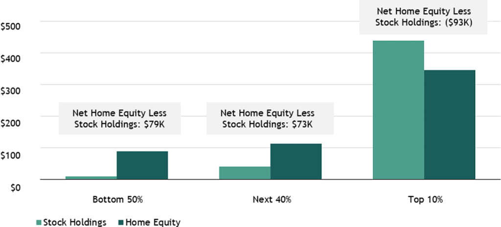
Source: Blackstone Investment Strategy and Federal Reserve Survey of Consumer Finances, 2019.
In my view, housing does not seem to be the major risk currently. In looking at it, we must separate activity from pricing. Activity levels are slowing, and they may very well decline further from here. But pricing is determined, in large part, by supply. I would argue that it was oversupply, lower lending standards and excess leverage that contributed to broad price declines in housing in the last cycle. Conditions appear almost the exactly opposite today: secular undersupply, exceptionally high lending standards and record homeowner equity.
Historical Comparison 2: Labor Markets
Another important dynamic to consider when thinking about the potential depth of a downturn relates to unemployment. In the aftermath of the Tech Bubble, the unemployment rate rose from 4.3% at the start of the recession to a peak of 6.3%, and it took just one year for personal income from wages to return to pre-recession levels.
Following the GFC and 1980s double-dip, the unemployment rate in both instances increased from 5–6% to roughly 10%. However, it took three full years after the GFC for personal income from wages to return to pre-recession levels. Conversely, personal income never fell during the 1980s recessions. Of course, inflation played a big role in personal income continuing to rise in the 1980s, as the wage-price spiral drove wage growth to a record high of more than 9% in January 1981. But even on a real basis, personal income rose by 5% from 1980 to 1982.
Labor markets in the Federal Reserve’s crosshairs Today, the Fed needs to continue hiking interest rates to cool off the red-hot labor market. However, there is little consensus as to how much the unemployment rate must increase to cause enough demand destruction to bring down the inflation rate. Some notable economic heavyweights, including former Treasury Secretary Larry Summers, argue that the unemployment rate must double for the wage-price spiral to break.
We looked at the historical relationship between various increases in the unemployment rate and the associated hit to GDP. Observe how Figure 4 descends from left to right, indicating that larger jumps in unemployment are correlated with deeper GDP declines. The 1980s and 2008 recessions featured significant deterioration in labor markets and more severe declines in GDP, while the 2001 recession did less damage to labor markets and the hit to GDP was more modest.
Figure 4: GDP Declines during Recessions, by Unemployment Rate Increases
(average change in real GDP when unemployment rate has increased by respective amount)
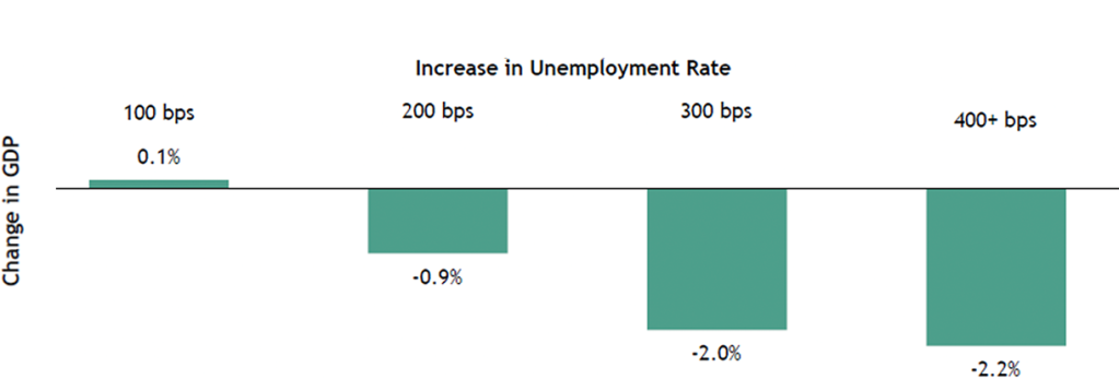
Source: Blackstone Investment Strategy, Bureau of Labor Statistics, Bureau of Economic Analysis and Bloomberg. Represents data for 11 recessions from 1948 to 2019. Change in GDP measured from start of each recession; change in unemployment rate measured from the trough in the 12 months before each recession. Note: Each category has the following number of observations: 100 bps, 11 observations; 200 bps, 9 observations; 300 bps, 6 observations; and 400+ bps, 3 observations.
Today, the big question is whether the Fed can cause a modest increase in the unemployment rate and achieve a “softish” landing. I do not believe that wages can be cooled by merely reducing the number of job openings, as there appears to be too much demand in the economy. Therefore, I think the unemployment rate will likely move higher.
Clear-Eyed about What’s Ahead
There is a growing consensus among forecasters and the public that a recession seems inevitable, but there is strong disagreement about the timing and severity. To provide a more objective framework for understanding “when” it might happen, I look for the following preconditions to fall into place: leading economic indicators contracting, corporate profits growth turning negative and the unemployment rate rising as companies pull back. There are many factors to consider when assessing the depth of a recession. But the 1980s double-dip recession, the Tech Bubble and Global Financial Crisis illustrate the critical role that housing and labor play. And these two factors are back under the spotlight in the current cycle. But strong household and corporate balance sheets and the positive outlook on US housing are arguments against being overly fearful about a severe downturn. I will continue to update my views as the conditions warrant.
In next month’s essay We will provide more details on the outlook for the US housing markets, including insights from Nadeem Meghji, Senior Managing Director and Head of Real Estate Americas at Blackstone. We featured Nadeem as a guest author last summer to discuss his views on housing, and we look forward to welcoming him back to these pages.
With data and analysis by Taylor Becker.
- Deutsche Bank, as of 7/4/2022.
- The recession indicators are defined as follows. “LEIs” represent the Conference Board US Leading Economic Index, year-over-year growth. A peak in this indicator represents a “signal” for the above table. Though a cycle’s “peak” can only be known in hindsight, negative year-over-year growth in this indicator always coincides with recession. “Corporate Profits” represents the year-over-year growth in total corporate profits before taxes with inventory valuation adjustment and capital consumption adjustment. Because corporate profits contraction is a necessary, but not sufficient, condition for recession, the profits contraction immediately preceding (or concurrent) with each recession is used. “Unemployment” represents the Sahm Recession Indicator, which signals the start of a recession when the three-month moving average of the national unemployment rate (U3) rises by 0.50 percentage points or more relative to its low during the previous 12 months.
- Bloomberg; Bloomberg Agg Bond Index and FHFA Home Price Index.
- Federal Reserve Survey of Consumer Finances, 2019.
The views expressed in this commentary are the personal views of Joe Zidle and do not necessarily reflect the views of Blackstone Inc. (together with its affiliates, “Blackstone”). The views expressed reflect the current views of Joe Zidle as of the date hereof, and neither Joe Zidle or Blackstone undertake any responsibility to advise you of any changes in the views expressed herein.
Blackstone and others associated with it may have positions in and effect transactions in securities of companies mentioned or indirectly referenced in this commentary and may also perform or seek to perform services for those companies. Blackstone and others associated with it may also offer strategies to third parties for compensation within those asset classes mentioned or described in this commentary. Investment concepts mentioned in this commentary may be unsuitable for investors depending on their specific investment objectives and financial position.
Tax considerations, margin requirements, commissions and other transaction costs may significantly affect the economic consequences of any transaction concepts referenced in this commentary and should be reviewed carefully with one’s investment and tax advisors. All information in this commentary is believed to be reliable as of the date on which this commentary was issued, and has been obtained from public sources believed to be reliable. No representation or warranty, either express or implied, is provided in relation to the accuracy or completeness of the information contained herein.
This commentary does not constitute an offer to sell any securities or the solicitation of an offer to purchase any securities. This commentary discusses broad market, industry or sector trends, or other general economic, market or political conditions and has not been provided in a fiduciary capacity under ERISA and should not be construed as research, investment advice, or any investment recommendation. Past performance is not necessarily indicative of future performance.
For more information about how Blackstone collects, uses, stores and processes your personal information, please see our Privacy Policy here: www.blackstone.com/privacy. You have the right to object to receiving direct marketing from Blackstone at any time. Please click the link above to unsubscribe from this mailing list.