Joe Zidle: The Right Question for This Stage of the Cycle
In discussing this essay with Byron, I outlined my view that rising prices and slowing growth will challenge policymakers, increase volatility and create downside risk. We have differing views on the emergence of inflationary pressures, and on the likelihood of the US entering recession in the near term. But at this point, the right question isn’t whether we will have another recession; it’s when. On this, Byron and I agree.
In this month’s essay, I lay out the case for why we should expect a recession sooner, rather than later. My intention is not to sound alarmist. Rather, the time to prepare for potential difficulties in the economy and the market is when everything is looking good. Right now, there are plenty of warning signals, and it’s important to consider them. In our quarterly webinar on October 10th, Byron and I will present you with our full views of the macroeconomic outlook, and the implications for investors. Let the debate begin.
The Yield Curve Remains Relevant
Twenty months, and the law of averages. I don’t necessarily think, like some of the most pessimistic people, that a recession is likely in the next six months. But I don’t think it will be in 2.5 years, either. The five previous inversions of the yield curve preceded recessions by 10–34 months, with an average lead time of 20 months. No recession ever followed an inverted yield curve by exactly 20 months; they all came sooner, or later. Less effective monetary policy in the face of slowing growth leads me to take the under this time.
Make no mistake, we’re on the clock. Among the approximately 40 sovereign yield curves we track, 10Y/2Y spreads in 10 countries were inverted within the past month, the highest number since the Global Financial Crisis. Spreads have narrowed to fewer than 25 basis points in another 10 countries. Not all yield curves are as predictive as the US curve, but among major economies, an inverted curve is considered a precondition for a recession. Currently, the US and countries like the UK, Germany, France, Switzerland, Canada, Mexico and others are at risk of recession.
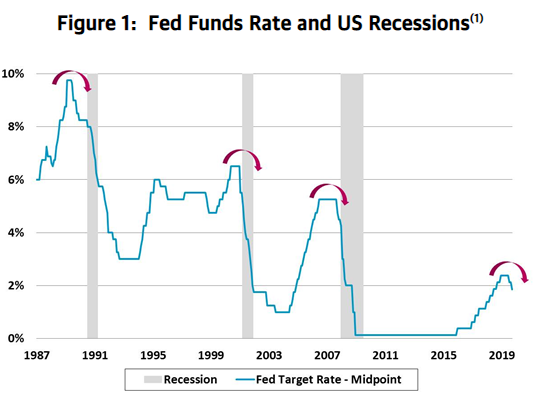
Too little, too late. In the last 30 years, the Fed hasn’t cut by more than 75bp consecutively without a recession following (see Figure 1). This suggests that by the time the Fed realizes it needs a full cutting cycle, it’s generally too late. Currently, the forward rate implied by Fed Fund futures prices in at least 50bp more in cuts, in addition to the 25bp cuts in July and September. If the markets had their way, they would essentially be pricing in a recession.
It’s not different this time. I do not see a consensus forming among investors that the yield curve matters, or that we are at high risk of entering recession. For this reason, I urge readers not to succumb to the sometimes convincing arguments that seek to minimize the relevance of an inversion.
The primary argument against the yield curve’s relevance today is that bond yields are so low because of a negative term premium and a glut of global liquidity. Some evidence used to advance this view includes yields of Treasury bonds, which are near all-time lows, and the proliferation of negative-yielding debt around the world. If this argument were to be believed, then the inversion isn’t fundamental, it’s technical. It’s simply the result of a unique set of central bank policies; deflation in Europe and Japan, and proactive rate reductions here in the US.
I would approach this argument skeptically. When the curve inverted in 2006, we felt protected from a recession because bulls argued that housing prices never fall. When the curve inverted in 1998, we were told that technology created a new paradigm that rendered business cycles obsolete. People actually cheered the inversion in 1989: Inflation had been conquered, and conventional wisdom was that inflation caused recessions. So, when long-term yields fell below short-term yields, it was practically cause for a national holiday. In each of these instances, consensus was caught off guard by the recession that ensued.
Things looked good at previous inversion points. Today, many of the key macro indicators tell us that the economy is on solid footing. But this is the most important lesson from studying the yield curve: It inverts when the data are improving. Looking at the previous five inversions of the 10Y/2Y, the economy appears to be in decent shape when the curve gives its signal. This helps explain why people are so quick to dismiss the warning signs from the curve. But the very power of the curve’s signal is that it typically challenges consensus—and wins.
In Figure 2, we plot the median trend of important economic indicators in the 12 months leading up to the last five inversions. Indicators tend to be stellar 12 months prior to the inversion, begin to decline, briefly turn negative and then start to recover. By the time the curve inverts, the economy appears to be in an upswing, and it’s hard to imagine that a recession could be in the offing.
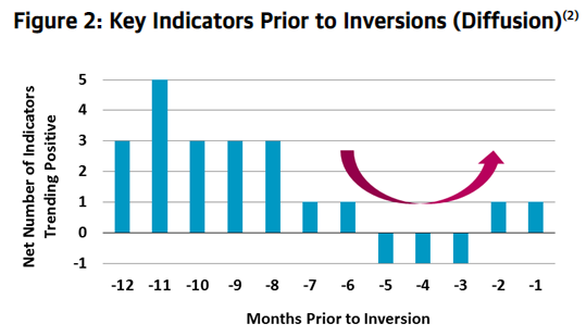
Note: Indicators include the capacity utilization rate, initial jobless claims, unemployment rate, US GDP growth and consumer confidence.
Flaws in a “have no fear, the Fed is here” view. Investors aren’t panicked about the yield curve because they believe the Fed can cut rates enough and create enough liquidity to prevent a recession. In my view, markets are on a collision course with central bankers. Investors want near-zero rates to combat global conditions and narrow the interest rate differentials with the rest of the world. However, signs of inflation in US producer prices, consumer prices and wages complicate the path to rock-bottom rates.
We may get one more cut in October, but policymakers will be hard-pressed to justify more action so long as growth is solid, labor markets are strong and wages are rising. A less-dovish Fed than the market expects could send equities lower and credit spreads higher. The 21% year-to-date in US equities can’t be credited to earnings growth (which has been flat) or economic growth (which is slowing).(3)
Fed must think globally, but act locally. Perhaps investors don’t fully appreciate the emerging inflationary pressures in the US, and how this trend will constrain the Fed’s ability to cut rates much lower. Core CPI is growing at its fastest rate since 2008, and above the Fed’s target. Upward price pressure from tight housing and rental markets is evident. With inventory levels at 30-year lows, lower mortgage rates should further stimulate demand. Of course, price increases also affect business dynamics; iron and steel prices moved meaningfully higher recently, perhaps due to trade. Labor costs are squeezing businesses too.
Average hourly wage gains in the last three months annualize at 4.2%, a rate of growth above the Fed’s typical pain threshold of 4%. Going back to the early 1980s, wage gains of 4% or more have been associated with higher inflation and Fed hikes, not cuts (see Figure 3). Cracks in the labor market are evident in job openings, hours worked and temporary employment data, but the low unemployment rate argues that wages will go higher. Blackstone portfolio company CEOs who responded to our recent surveys reported higher wage gains than government statistics for all of 2018 and the first two quarters of 2019.(4) Nearly 60% of our CEO respondents are expecting to increase wages in their companies by more than 3%.
Figure 3: Average Hourly Earnings Growth (YoY % Change, 3 Mo Avg.)(5)

Growth Is Slowing, but Rates Are Already Low
The US isn’t an island. Leading economic indicators (LEIs) in the US are falling in tandem with global LEIs. GDP growth is set to decelerate further, with the Atlanta Fed GDPNow tracker recently slipping below 2%.(6) Many other macro indicators also turned down over the past several months. Among them are corporate earnings. Quarterly profits growth for the S&P 500 hovered near zero for the first half of the year, and consensus forecasts for the third quarter are not looking any better. Historically, quarterly profits growth needs to fall as a pre-condition for a recession.
Early signs of stress in employment markets. The most important trend to watch over the next six months will be whether cracks spread from the leading edges of employment into broader measures. Two areas in particular are of concern. The first is the recent drop in the number of job openings. In early 2018, we all watched in amazement as the number of unfilled jobs exceeded the number of unemployed workers for the first time in history. At their peak, job openings outnumbered job seekers by 1.5 million. But since January, the number of open jobs has fallen by more than 400,000.(7)
Second, the number of hours worked remains soft after peaking at 34.6 hours in 2016.(8) The trend in overtime hours for all private workers is similarly lower. Given the broad weakness in US manufacturing, it’s no shock that the number of overtime hours put in by manufacturing workers has had its largest percentage decline since the run-up to the Global Financial Crisis.
CEOs who responded to Blackstone’s most recent portfolio company sentiment survey indicated that they weren’t growing their workforce as quickly as in prior quarters, and that increases in productivity slowed.(4) Our data mirror the small business data reported by the National Federation of Independent Business (NFIB). The proportion of small firms that plan to hire dropped from 26% in 2018 to 20% in the most recent survey.(9)
By many measures, the labor market remains the strongest in a generation. We don’t want to read too much into short-term weakness. But the indicators we highlight may be leading the broader jobs market. We’re watching carefully, as we expect further deterioration before the end of this economic cycle.
Monetary Policy Has Its Limits
It tastes great, but it’s not very filling. The law of diminishing returns must be considered, given that rates around the world are already at rock-bottom lows. Historically, when the Fed cuts rates to offset slowing growth, it does so from a much higher base. Prior to the last three recessions, the Fed lowered rates by at least 500 basis points to cushion the economic downside.(10) Today, the Fed has no more than seven 25 basis point cuts left at its disposal.
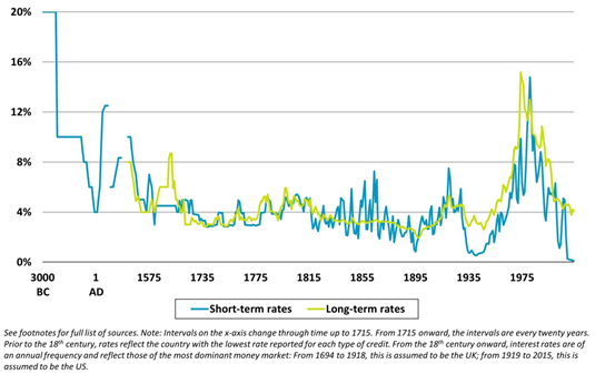
As for other central banks, rates around the world are already at a 5,000-year low (see Figure 4). Coordinated easing sure has felt good for financial assets, but the reality is that lower rates are showing no signs of stimulating real economic growth at this point. Perhaps global rates will soon hit a 6,000-year low.
Figure 4: Historical Short- and Long-Term Interest Rates(11)
Not much left in the tank. It’s not clear what tools policymakers have left to fend off or climb out of recession. Verbal intervention and more quantitative easing seem to be the only options. At their recent meeting, European Central Bank officials virtually promised to keep rates negative and quantitative easing (QE) open-ended indefinitely. While they didn’t quite promise these policies “in perpetuity,” they pledged to keep these policies until Euro area inflation hits 2%. The two may as well be interchangeable.
Next steps in the US and Europe could include discussion of yield curve controls, similar to those instituted in Japan. Beginning in 2016, policymakers in Japan targeted rates at specific maturities, such as the 10-year government bond. But it hasn’t worked, and there is scant evidence that it would work in Europe given how the continent shares similar demographic and productivity issues as Japan.
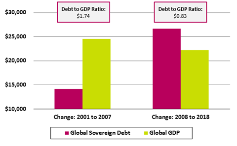
Diminishing returns in debt. More QE is the other policy tool. But as Figure 5 illustrates, the productivity of this debt has declined dramatically over the past decade. Between 2001 and 2007, global sovereign debt increased by over $14 trillion, while global GDP increased by nearly $25 trillion. That means that for every $1.00 of sovereign debt incurred, $1.74 of global GDP was created. From 2008 to 2018, in the wake of the Global Financial Crisis, sovereign debt ballooned by nearly $27 trillion, but global GDP grew by only $22 trillion. Over this period, global GDP equates to 83 cents for every dollar of debt produced.
Figure 5: Global Sovereign Debt and GDP (2001 to 2018, $ in billions)(12)
The 1970s Offer a Cautionary Example
Markets are on a collision course with policymakers. Fundamentals don’t justify today’s lofty valuations in equities or the near-record tight spreads in credit. The next 6–12 months should be more volatile, with increased downside risk.
The most likely scenario is slowing growth and higher prices, with an elevated risk of a recession. In some respects, these conditions describe the 1970s. During that decade, growth slowed, inflation accelerated and two recessions stung the economy. Figure 6 highlights asset class returns through the course of the decade.
Figure 6: Annualized Total Return by Asset Class (1970s vs. Long-Term Average)(13)
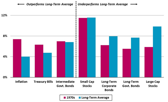
Implications for investor portfolios. Equities and bonds generally underperform their long-term average performance in periods of high inflation and/or stagflation, and we would expect similar results in the current environment. In the 1970s, companies able to grow faster (small caps vs. large caps) and assets with pricing power (commodities and real estate) showed relative outperformance. The biggest risks to portfolios are in long-duration bonds or bond proxies, such as slow-growth and dividend-oriented investments.
1. Source: Federal Reserve and Bloomberg, as of 9/30/19.
2. Source: Federal Reserve, Bureau of Labor Statistics, Bureau of Economic Analysis and University of Michigan. Represents five inversions of the 10Y/2Y spread in 1978, 1980, 1988, 1998 and 2005.
3. Source: Bloomberg. Represents S&P 500 total return with dividends reinvested in the index, as of 9/20/19.
4.Based on a subset of Blackstone’s corporate private equity portfolio companies, as of 6/30/19.
5. Source: Bureau of Labor Statistics, as of 8/31/19. Represents the three-month rolling average of average hourly earnings for production and nonsupervisory employees.
6. Source: Atlanta Fed GDPNow model, based on 9/18/19 release.
7. Source: Bureau of Labor Statistics, as of 7/31/19. Represents all private job openings.
8. Source: Bureau of Labor Statistics, as of 8/31/19. Represents average weekly hours of all private employees.
9. Source: NFIB Small Business Hiring Plans Index, as of 8/31/19.
10. Source: Federal Reserve. Based on the Fed easing cycle immediately preceding the recessions in 1990, 2001 and 2008.
11. Source: Bank of England; Harlane, “Stuck” (speech at Open University, June 30, 2015); Homer and Sylla (1991); Heim and Mirowski (1987); Weiller and Mirowski (1990);Hills, Thomas and Dimsdale (2015); Historical Statistics of the United States Millennial Edition, Volume 3; Federal Reserve Economic Database.
12. Source: Bank of International Settlements and World Bank, as of 12/31/18. Global GDP in current US dollars. Global sovereign debt represents credit to all general government in BIS-reporting countries, at market value in US dollars.
13. Source: Morningstar Direct and Ibbotson Associates. Long-term average represents the period 1/1/1968 through 12/31/2018. Total returns are annualized.
* * * * *
The views expressed in this commentary are the personal views of the author and do not necessarily reflect the views of The Blackstone Group Inc. (together with its affiliates, “Blackstone”). The views expressed reflect the current views of the author as of the date hereof and Blackstone undertakes no responsibility to advise you of any changes in the views expressed herein. For more information about how Blackstone collects, uses, stores and processes your personal information, please see our Privacy Policy here: http://go.pardot.com/e/213192/privacy/68f9x/182811975?h=L3PDlTnbE2h0R6yw-jpiXWquHwiOdKAOzy99H3DK9f8.
Blackstone and others associated with it may have positions in and effect transactions in securities of companies mentioned or indirectly referenced in this commentary and may also perform or seek to perform services for those companies. Investment concepts mentioned in this commentary may be unsuitable for investors depending on their specific investment objectives and financial position.
Tax considerations, margin requirements, commissions and other transaction costs may significantly affect the economic consequences of any transaction concepts referenced in this commentary and should be reviewed carefully with one’s investment and tax advisors. All information in this commentary is believed to be reliable as of the date on which this commentary was issued, and has been obtained from public sources believed to be reliable. No representation or warranty, either express or implied, is provided in relation to the accuracy or completeness of the information contained herein.
This commentary does not constitute an offer to sell any securities or the solicitation of an offer to purchase any securities. This commentary discusses broad market, industry or sector trends, or other general economic, market or political conditions and has not been provided in a fiduciary capacity under ERISA and should not be construed as research, investment advice, or any investment recommendation. Past performance is not necessarily indicative of future results.